Let’s be real—picking kitchen colors is stressful. One minute you’re scrolling Pinterest, convinced mint green cabinets are your destiny. The next, you’re knee-deep in paint swatches, paralyzed by indecision. Been there, spilled coffee on that. But after years of trial, error, and a regrettable flirtation with neon orange, I’ve cracked the code.
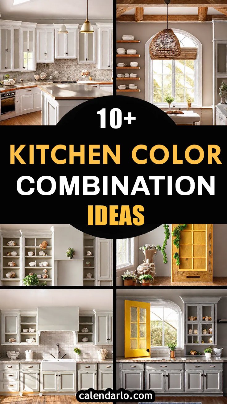
12 Kitchen Color Combos
Here are 12 color pairings aren’t just pretty—they’re vibes. Whether you’re into cozy farmhouse charm or sleek modern edge, there’s something here to make your heart (and your Instagram feed) happy. Let’s get into it!
1. Classic White & Navy Blue
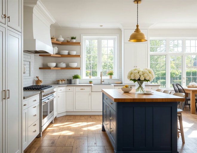
Confession: I used to think navy was “too bold” for kitchens. Then I tried it. Holy wow. Crisp white cabinets paired with a moody navy backsplash or island feel like a tailored tuxedo—polished but never stuffy.
It’s that perfect balance of light and dark, especially if you add brass knobs or a wooden butcher block countertop. Pro tip: Go matte with that navy. Glossy finishes show every fingerprint, and ain’t nobody got time for daily Windex marathons.
Why It Works: Navy’s deep hue creates intimacy without closing in the space. It’s like that friend who’s both fun and reliable—works with coastal themes, modern minimalism, or even a Parisian bistro vibe.
Throw in some open oak shelves with white dishes, and suddenly your kitchen’s giving “I vacation in Nantucket.”
2. Sage Green & Warm Wood Tones
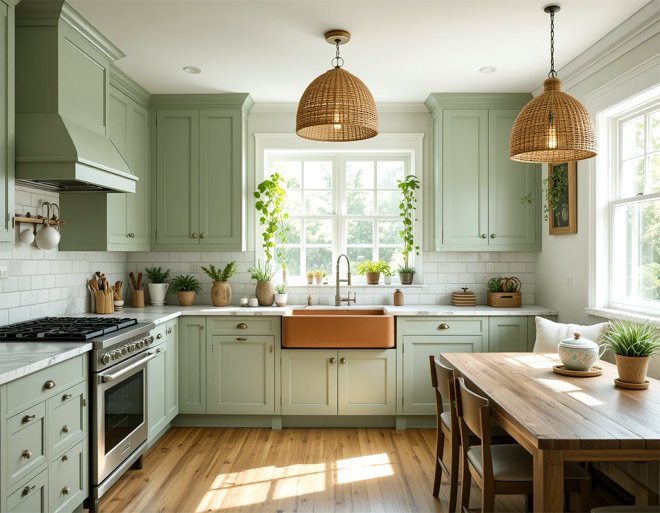
If your kitchen had a spirit animal, this combo would be a cozy cashmere sweater. Sage green cabinets (try Farrow & Ball’s “Pigeon”) paired with caramel-toned wood floors or floating shelves feel like a quiet morning with a latte.
I added terracotta planters with trailing ivy to mine, and now my kitchen doubles as a zen garden.
Behind the Palette: Sage’s gray undertones keep it from feeling “kermit the frog” green, while warm wood adds organic texture. Perfect for small spaces—it reflects light but still feels grounded.
Just avoid pairing it with cool metals (looking at you, chrome). Stick to aged brass or iron for hardware.
3. Soft Gray & Vibrant Yellow
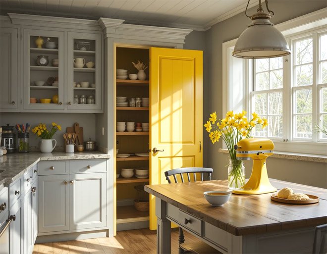
Gray kitchens get a bad rap for being “cold,” but add a pop of yellow and bam—instant serotonin. Picture this: soft dove-gray walls, a sunshine-yellow farmhouse table, and a vase of daffodils.
It’s like spring decided to move in permanently. I painted my pantry door “Buttercup” by Behr, and now even my cereal tastes happier.
Pro Moves: Stick to warm grays (think: greige) to keep things inviting. Use yellow in doses—backsplashes, small appliances, or tea towels. Too much and you’ll feel like you’re living inside a highlighter.
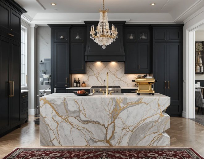
4. Black & Gold Accents
Okay, hear me out: black kitchens aren’t just for Bond villains. Pair matte black cabinets with gold faucets and marble counters, and suddenly you’re in a 5-star hotel bar.
I did this in my last condo and still miss how my wine glasses sparkled against the dark backdrop.
Keep It Luxe: Lighting is non-negotiable here. Layer pendant lights over the island, under-cabinet LEDs, and a statement chandelier. Add a Persian rug with burgundy or ochre tones to warm it up.
Bonus: Black hides spaghetti sauce splatters like a champ.
5. Terracotta & Cream
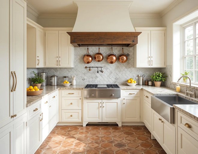
Terracotta isn’t just for flower pots anymore. Pair those warm, earthy tiles with creamy Shaker cabinets, and your kitchen becomes a Tuscan villa.
I redid my floors in terracotta hexagons last year, and now my morning espresso routine feels absurdly cinematic.
Pro Tip: Seal those tiles! Terracotta’s porous, so a good sealant prevents red wine disasters.
Balance the warmth with crisp white linens or a stainless steel farmhouse sink.
6. Blush Pink & Charcoal Gray
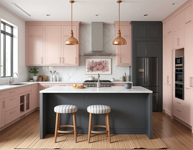
Blush pink is the millennial pink’s chill older sister. Pair it with charcoal gray (try “Iron Mountain” by Benjamin Moore), and you’ve got a combo that’s sweet but not saccharine.
My bestie did blush upper cabinets with a charcoal island, and it’s chef’s kiss with her copper pendant lights.
Secret Sauce: Blush promotes calm (science says so!), while charcoal adds sophistication.
Keep the pink muted—think dusty rose, not bubblegum. Add texture with a woven rug or linen curtains.
7. Midnight Blue & Brass
Midnight blue is that mysterious friend who’s secretly a softie. Use it on lower cabinets or an accent wall, then add brass drawer pulls and a statement range hood.
I once saw this combo in a Brooklyn brownstone, and I’m still not over it.
Why It Slays: The blue’s depth makes large kitchens feel intimate, while brass adds a touch of Gatsby-era glam. Let your hardware tarnish slightly over time—patina = instant vintage cred.
8. Olive Green & Mustard Yellow
Channel your inner ’70s hostess with this retro duo. Olive green lowers + mustard open shelves = a kitchen that’s ready to serve fondue and tell stories about Woodstock.
I added a vintage rotary phone to mine, and now my Gen Z niece calls it “weirdly cool.”
Balance Hack: Olive’s muted tones keep mustard from feeling overwhelming. Use it on smaller surfaces—barstools, a kitchen nook, or even a retro SMEG fridge.
9. Pale Blue & Crisp White
This combo is the coastal grandma of kitchen palettes. Pale blue cabinets (Sherwin Williams’ “Rain”) with white subway tiles and rattan barstools? Yes, please. It’s breezy, bright, and impossible to hate.
Pro Insight: Pale blue lowers stress—ideal for chaotic family kitchens. Use semi-gloss paint for easy wipe-downs after pancake-flipping disasters.
10. Rich Emerald & Matte Black
Emerald green is the drama queen your kitchen deserves. Pair it with matte black hardware and a white marble island, and suddenly you’re hosting dinner parties with Clue-board-game energy.
Keep It Fresh: Add plants. Lots of them. A fiddle leaf fig in the corner or herbs on the windowsill keeps the vibe lush, not stuffy.
11. Warm Beige & Soft Mint
Beige isn’t boring—it’s a neutral, okay? Pair “Accessible Beige” by Sherwin Williams with mint-green cabinets or tiles, and you’ve got a kitchen that’s soothing but still fun.
My aunt did this with a retro pink stand mixer, and now her kitchen looks like a Wes Anderson set.
Color Therapy: Beige grounds the space; mint adds whimsy. Perfect for rental kitchens—it’s subtle enough to please landlords but still feels you.
12. Bold Red & Neutral Gray
Red lower cabinets with gray uppers are like that friend who’s always down for karaoke—bold, fun, and impossible to ignore.
I added chrome accents and a vintage diner table to mine, and now my kitchen’s the unofficial neighborhood hangout.
Rule of Thumb: Use red sparingly. Too much and you’ll feel like you’re cooking in a fire truck. Balance it with lots of natural light and neutral textiles.
Final Thoughts
Your kitchen’s colors should make you feel something—whether that’s calm, joy, or “I need to throw a dinner party ASAP.” Don’t stress about trends.
That terracotta floor I mentioned? I spilled an entire pot of coffee on it last week. You know what happened? It blended right in. Perfection is overrated; personality is forever.
Now go forth and paint something ridiculous. And if you end up hating it? There’s always another coat (or a strong cocktail). Tag me in your before-and-afters—I’ll bring the confetti!
